 You may have spent thousands of dollars designing, building and marketing your business website. How do you know if it’s working? You can track traffic to and leads from your site. You can search for your keywords to see how you rank. But it may change day-to-day, not just month-to-month.
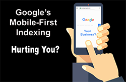
Trust Lone Bird Studio to keep your website ranking high, as we know what to look for. Google continually changes its algorithms in ways that directly impact how it ranks your website. So what is Google mobile indexing and why does it matter to you? Let’s begin by tackling the first part of that question, so you get an inkling of whether it’s killing your business or boosting it.
What Is Google Mobile Indexing?
Sometime in 2014, the number of people using mobile devices to search the internet passed the number of people using desktops and laptops. And all of a sudden, mobile users became vital to your business. Actually, mobile users have been trending up almost since smart phones were invented.
Google has acknowledged the trend and made mobile-friendly websites rank higher than those that don’t have a mobile website design. It makes sense, as more and more people access the internet on mobile devices. Google mobile indexing means that Google looks at your mobile site first. If it’s unresponsive or incomplete, you’re ranked lower.
So if you haven’t given your site a mobile web design, your site is going to suffer in Google searches. Since Google accounts for more than 90 percent of all internet searches (in October 2018), you can’t afford to rank lower. You’ve worked hard at SEO and design. If you neglected to include a mobile web design, then Google mobile indexing will kill your business!
How Can You Implement Mobile Website Design?
To be compliant with the Google mobile indexing, your website simply has to work — it has load quickly, work perfectly and look great — on a device as small as a smartphone. Lone Bird Studio knows that mobile sites need to do certain things to save space (which is at a premium) and time (ditto), such as:
• Choose a mobile-friendly design template, not just a mobile-responsive design.
• Confine your web design, graphics and content to the screen size, not to an arbitrary frame or page width.
• Optimize all your images for fast loading.
• Resize the graphics and the copy so both are readable and not overwhelming.
• Make sure your mobile version has all the information your full site offers.
• Remove hovering elements, which don’t render on a mobile device.
• Delete any Flash and pop-up elements. They don’t work on mobile devices either.
If you ignore Google mobile indexing, your search ranking will suffer, which directly translates into business-killing lost sales. To get and implement a mobile website design and restore your website to its place on Page 1 of Google searches, contact Lone Bird Studio.